


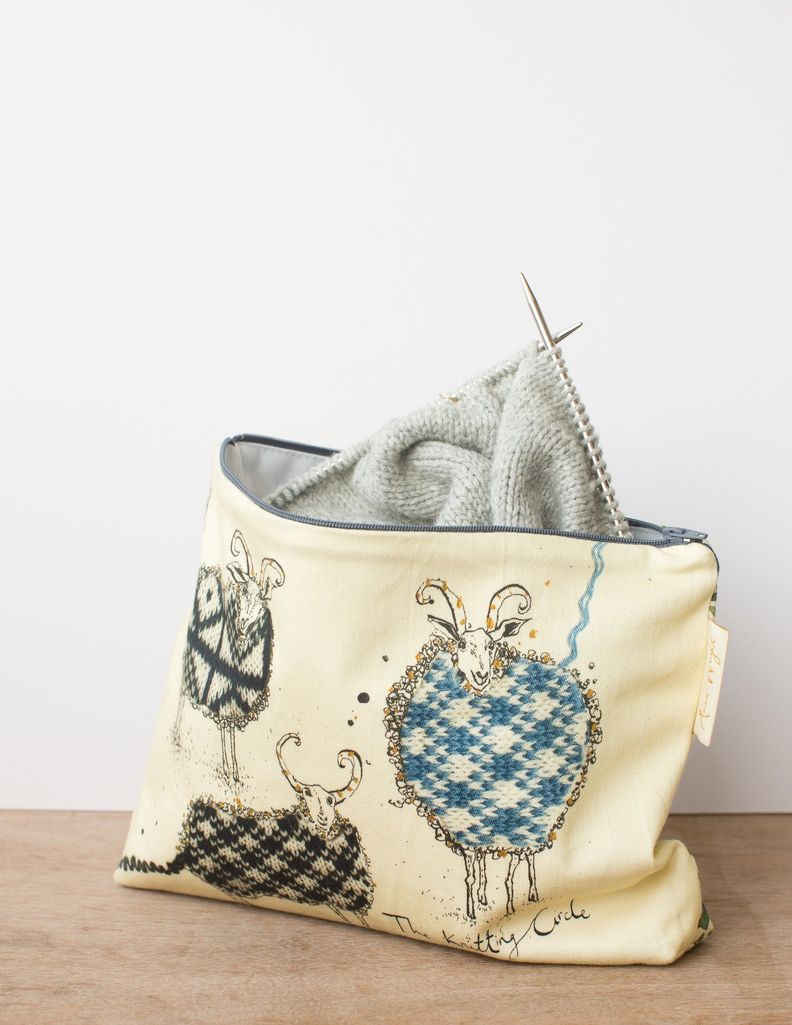
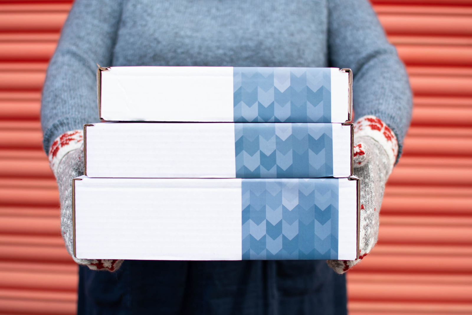
Kits

New! Celebrate this chapter of Ysolda.com as it comes to an end with a special, personalised bundle of our best products, hand-picked by our team just for you.


gift 2019

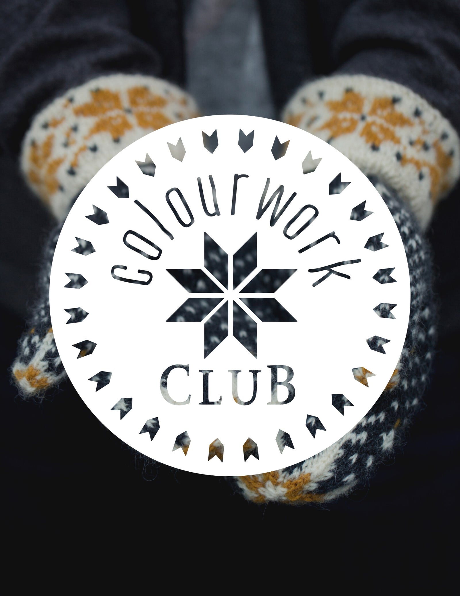


Subscribe to our Colourwork Club for a gift that lasts well into the new year. Your recipient will receive a new colourwork kit in Janurary, February and March
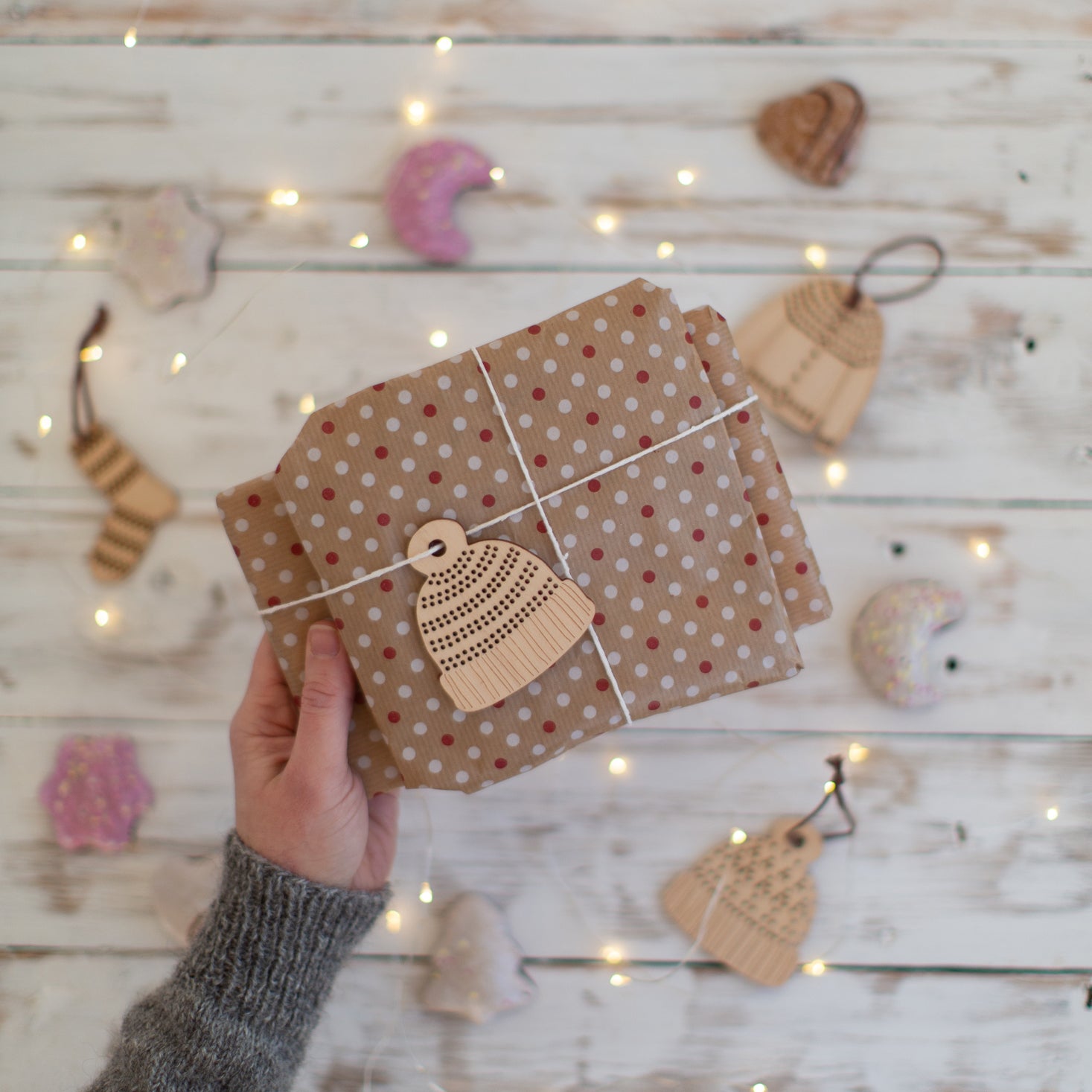
Last minute shopping? Gift cards are delivered electronically - forward the email or print it for your recipient. A range of amounts are available and gift cards don't expire.
Choosing Colours, a guest post from Felicity Ford

You may have had the experience of encountering an amazing wall of different coloured yarns in a yarn store and finding the prospect of all those colours both delightful and daunting. The colours! So many options! But where to start with choosing, and how can you tell if colours that look great together as balls of yarn will still be delightful once you begin knitting with them?
One theme explored in the KNITSONIK Stranded Colourwork Sourcebook involves choosing colours for stranded colourwork projects. Today for Technique Thursday I will share some of my ideas on this subject. I will present selected examples and tips from my book as rough guidelines and not as rules. I hope they assist you in your knitting adventures!
Here are my top tips, with explanations for each to follow:
- Start by finding an inspiration source that you love
- Choose colours for projects by matching yarn shades to that inspiration source
- Ensure contrast when choosing colours so that your knitted designs will stand out
Start by finding an inspiration source that you love
It may seem counter-intuitive for a techniques post about choosing colours to begin with finding an inspiration source; surely looking at all the tasty yarn shades is the best starting point? However I have found that beginning with lots of gorgeous balls of yarn can be a bit overwhelming and reveals little about how those shades will interact once knitted.

For instance I once took a whole host of beautiful shades of Hebridean 2-ply by Alice Starmore that looked delicious together as wee balls and seemed destined to sing together. But when I knitted with them, I was surprised and unhappy to observe that the shades I had chosen did not work well: this was not the beauteous colourwork I had envisaged!

After making this useful mistake I realised I could help myself with future stranded colourwork projects by more carefully observing colour relationships in the world around me: it is logical that if colours look good mixed in objects found in everyday life then they might also combine well in stranded colourwork. It can be reassuring to look at something and say “those colours look amazing together, I will try that combination out in my own knitting”.

In the KNITSONIK Stranded Colourwork Sourcebook I give an example of using my walnut tree for inspiration. I love this tree and when it stands brightly against the summer sky all the colours work together. Exploring the relationships between leaves, branches, bark and sky helped me choose colours that worked together for my knitting.

Short instructions: pick an inspiration source that you love and remember;
- The things that delight you can be mined for knitterly inspiration
- If the colours look great together in your inspiration source then there should be a way to make them look great together in your knitting!
Choose colours by matching yarn shades to your inspiration source
Colour-matching can be done by holding a shade-card or balls of yarn against an inspiration source and checking for close matches in colour.
What colour-matching reveals
If I was merely thinking about my walnut tree and visiting a yarn store I might select a brown shade, a pale blue shade, and some greens. (Those are the right colours for a tree, right?) However matching the tree to different shades of yarn reveals several surprises!

The darker parts of the bark are a complex purple brown.

The creamier parts of the bark are almost biscuit coloured (FC43) or a warm lilac grey (78).

The very tips of the leaves are a pinkish colour, and there is some yellow involved.

Using the technique of holding yarns and shade-cards up to the tree produces a surprising range of colours. I am not sure I would have chosen such shades if I had just tried to guess the right colours for a walnut tree!

Matching yarn to objects can help to challenge prejudices and assumptions about colours.

For example, duck eggs are not necessarily the famously named “duck egg blue” but can be represented by, amongst other shades, a sort of luminous white.

Prunes turn out not to be the deep plummy purple one might imagine, but a sort of heathery black; the white flecks resemble the glistening wet surface.

Colours which you would never normally pick, or which may seem not to be “your colours” may turn out to be perfect for a knitting project. I have never much liked purple, but seeing how this exuberant lilac shade pops in the garden when my artichokes run to flower has given me a new perspective and shade 49 has snuck into many of my subsequent knitting projects!
Choosing colours through matching is a lot of fun; I hope you can imagine running around with balls of yarn in your pockets ready to match them to the world! However this playing also provides important ideas for different shading effects. All the time spent trying to see which shade of brown or green is the closest match is also spent learning how colours move from from light through to dark across branches and leaves. This information is useful when you start knitting and thinking about shading.

Short instructions: choose colours through matching and remember;
- Your inspiration source may surprise you.
- Observing how colours interact in your inspiration source will give you ideas for how they might work together in your knitting.
Ensure contrast so that your designs stand out
My final tip for choosing colours is that once you have found a palette, you may wish to ensure it contains contrast.
My walnut tree presents many different surface textures and these help to visually separate out its various elements. However when you knit with your yarn you will produce a fabric with a uniform surface and the main factor which will help patterns to stand out clearly is contrast.
An easy way to ensure contrast is to squint, blocking out the colour receptors in your eyes and enabling you to see dark and light more clearly. If you have a smart phone you can also take a black and white photo of your yarn shades to check that they stand out distinctly from one another. If they don’t, you can introduce contrast by finding colours that are already in your palette and adding darker or lighter versions of them.

Although the beautiful mid-blue of FC15 seems a perfect match for a midsummer sky, this shade does not contrast very much at all with the other shades in my walnut tree palette.

To mimic the high contrast effect of branches against sky seen in reality, lighter blues are required.

Short instructions: check for contrast within your palette by squinting at your colour choices or taking a black and white photo of them and remember;
- Making things darker or lighter can help your patterns to stand out!
- BUT if you want to create a more subtle effect, the opposite is true…
Choosing colours for garments
This process of choosing colours through observation and colour matching reveals hidden magic in familiar places. It involves looking around your neighbourhood and home for inspiration and then experimenting with yarn to find all the colours hidden there. These ideas can then be used to produce wondrous garments connected to your environment and imbued with the pleasures of choosing – and playing with – colours.

I chose the pretty patch of weeds at the end of my street as an inspiration source, initially because I liked the green and blue together in the vivid foliage and green alkanet flowers (which are actually blue).

In practice I struggled to find the best way to show these flowers in my knitting. I felt I never managed to get sufficient contrast between the greens and the blues for the pattern to really stand out…

…however through observing the total palette of this corner of my street, I found other interesting colour relationships and a rich overall palette with which to experiment.

I was especially happy to notice that areas of repair in the brickwork involve different coloured mortars, and took this idea forward in one set of charts used with my Fingerless Mitts pattern.

You can see that the mortar in my mitts changes colour just like the mortar between the bricks in my street. Matching shades helped me to find and choose colours for these mitts.

Colours in general
I want to finish this Technique Thursday post by sharing some of my favourite exercises for developing confidence with colour.

Exploring your kitchen cupboard with a shade card can reveal how many colours there are amongst your herbs and spices.
You can also learn a lot about colour by going to the DIY store, helping yourself to one of every single paint shade card, and matching them to the world around you.


If all else fails, you can’t go wrong with reading a yarn shade card at bedtime. When I was writing my PhD thesis I relaxed at night by looking at the beautiful colours in the Jamieson & Smith shade card: it was better than a story because within the many shades I could recognise my favourite things and places.
Giveaway Winner
Finally, I used a random number generator to locate a winner for the book giveaway announced earlier in the week and this winner is Louise Edsall who reflects on the inspiration provided by her bees:
My inspiration for stranded colorwork is my beehives. I am a beekeeper and the colors in my hives are glorious. The beautiful pollen tucked into the honeycomb in reds, pinks, golds, yellows, greens and whites create a patchwork of color. The warm reddy brown of the propolis (plant resins bees bring in to make hive airtight and line their honeycomb edges for antibiotic properties), the chamois browns of the wax caps over the honeycombs protecting developing baby bees, the beautiful nectar on its way to becoming honey looks like stained-glass of a cathedral when held to the light. The bees themselves with their warm tones and distinctive black stripes and fuzzy yellow hairs which pollen sticks to are an inspiration into themselves. The beautiful sunshine and blue skies that my little bees soar up to over the green canopies of summer in search of their flowers. Thank you for allowing me to share this. Now I must get busy on the design. This has been a great start to my day to reflect on my honeybees and their gifts to us.
WOOHOO! What riches of colour and texture this comment conjures. Congratulations Louise! A book will soon be on its way to you and I hope it helps you find ways to knit your bees.
Everyone’s amazing comments – left on Ysolda’s review – blew me away. The world is clearly full of things which are special in deeply personal ways and worthy of knitterly celebration! I wish you all many hours of fun matching your stash to the world around you and finding inspiration in unexpected places. Turbo thanks to Ysolda for writing such a complete, careful and thoughtful review of my book earlier this week and for hosting me here for Technique Thursday. I hope you have all enjoyed it!
YOURS IN COLOURS, xF

The KNITSONIK Stranded Colourwork Sourcebook by Felicity Ford contains many tips similar to those shared in this post. You can find her on instagram @Knitsonik
Also in Journal


Ysolda’s size chart for knitwear designers
Inclusive size charts for sizes xxs to 7xl, created by a knitwear designer and featuring measurements that can be difficult to find. Newly updated with an extended size range with measurements for cup sizing and broad shoulders.
Read More

Deep Shadow Heel Tutorial
The Deep Shadow sock heel is a beginner friendly short row sock heel that provides a more anatomical fit like a heel flap and gusset.
Read More


20 Years of Ysolda Knitting Patterns: Part 2
June 2025 marks twenty years of designing knitting patterns for Ysolda. In this blog post she picks her favourite from each year for 2015 to 2025,
Read More