


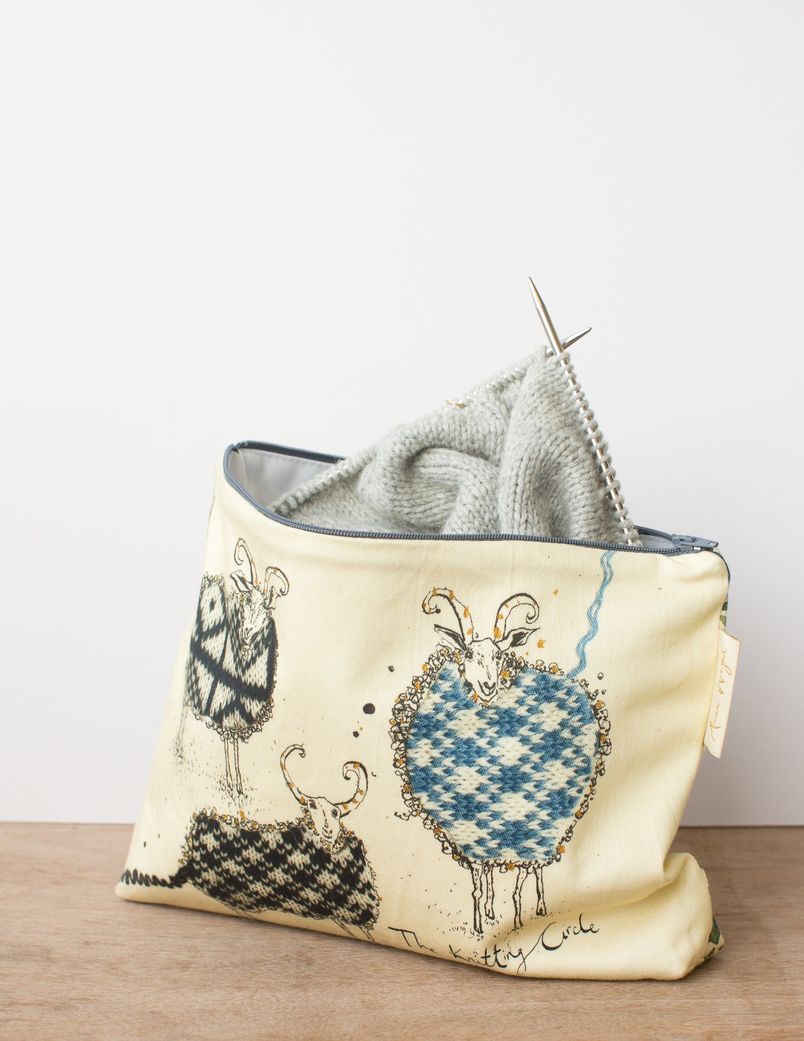
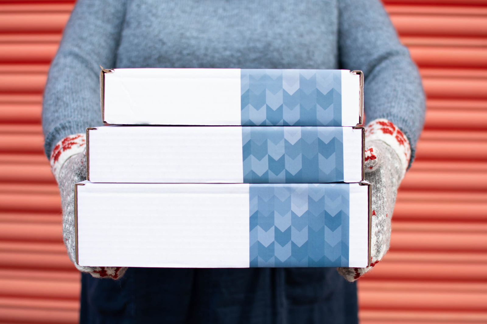
Kits

New! Celebrate this chapter of Ysolda.com as it comes to an end with a special, personalised bundle of our best products, hand-picked by our team just for you.


gift 2019

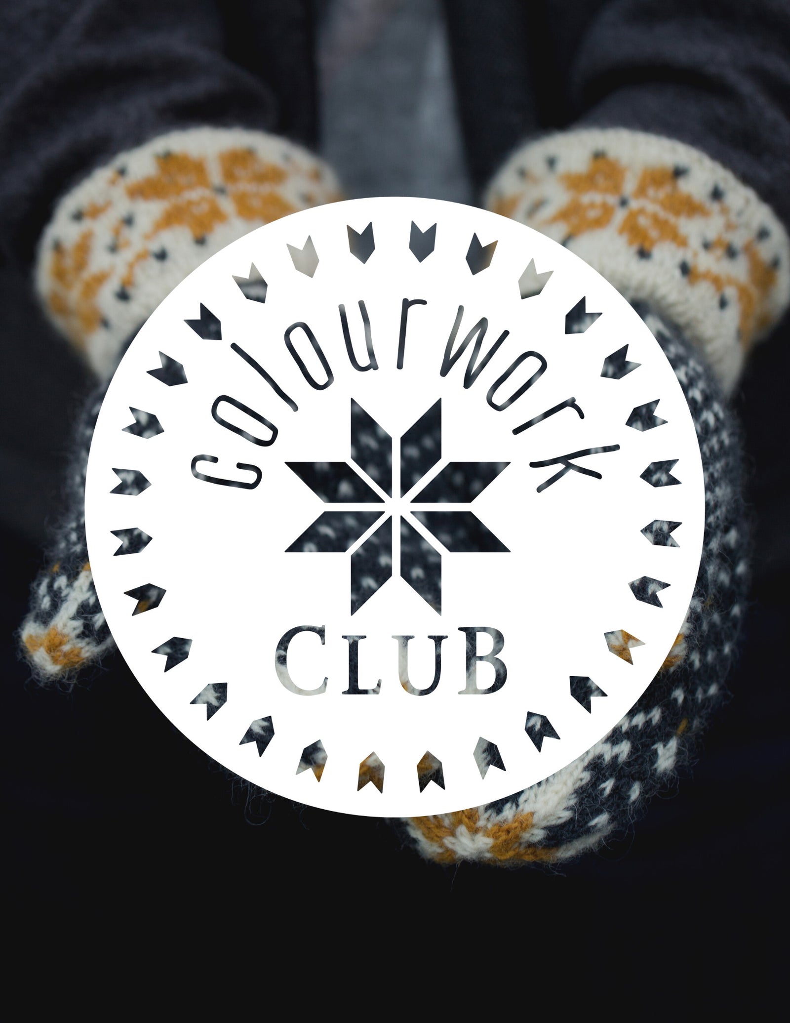


Subscribe to our Colourwork Club for a gift that lasts well into the new year. Your recipient will receive a new colourwork kit in Janurary, February and March
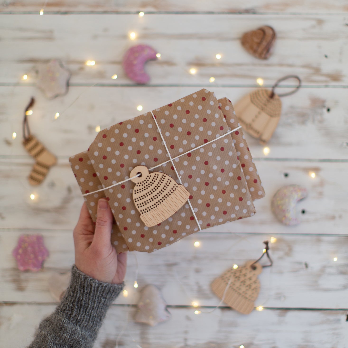
Last minute shopping? Gift cards are delivered electronically - forward the email or print it for your recipient. A range of amounts are available and gift cards don't expire.
Cruden vest alternative palettes

Last week I released a pattern that’s been more than a year in the making, as it was repeatedly set aside in favour of more pressing projects and then cut apart and partially re-knit to perfect the proportions. Vests, especially my collection of Fair Isle ones purchased in Shetland from The Shetland Designer and Jamieson’s of Shetland, have become a key part of my spring and autumn wardrobe over the last few years. Cycling across the city almost every day in wet, blustery weather makes a garment that keeps your core warm without overheating perfect — my route home really is uphill all the way! But I design knitwear for a living, and I sort of detest knitting sleeves, so it seemed absurd that I didn’t have a Fair Isle vest I’d made myself.

I dithered a bit about whether there was even any need to ‘design’ such a classic garment but when I started looking for patterns I was surprised by how few were out there. My friend Mary Jane Mucklestone has a gorgeous one that’s part of a Craftsy class you might find very helpful if either her pattern or Cruden both appeals to and intimidates you. Many others are beautiful but more creative interpretations of the idea than I was looking for, while the most common source might be the Rowan Yarns back catalogue where they’re all worked flat and seamed.

And so here is Cruden, worked in the round with steeks, with just two alternating patterns — one peerie and one larger. On alternate repeats the larger pattern is offset for a more balanced allover effect. The pattern includes illustrations of my preferred steeking option and a fun colour in version of the chart. Perfect for urban cycling in horrible weather or blending into the Shetland landscape on a sunny day. The name was my great grandfather’s surname and the prior to the outbreak of war, and the subsequent loss of his Norwegian customer base, my granny’s family spent the summer’s working in Shetland where he had a chandlery business. If you’re interested in the WWII relationship between Shetland and Norway I’m currently reading this fascinating book.

The original palette for Cruden was built around the main green, which I was so excited by when Jamieson and Smith added it to their line. Although the more earthy, muted tones are usually considered to be the colours of Shetland, the most magical thing about the landscape is the constantly changing light. The muted tones are there, but so are these deeper, more vibrant ones and the same view can switch from one to the other as fast as the clouds scurry across the sky. The green is a subtle heather, not just green but full of the gold tones in the mossy grass that become dominant as the hills recede.
Of course there are currently 92 shades of Jamieson and Smith Jumper weight, plus the naturals in the interchangeable Supreme line so you might want to mix things up for your own Cruden (if you just want to see which colours I used the details, including quantities, are on the pattern info page). Putting together colours for Fair Isle, particularly when both background and pattern colours are shaded, is really tough and usually involves a lot of swatching. Last week I dug out some knitting machine punchcards I’ve barely used and tried punching out the Cruden stitch patterns. I know have a new respect for anyone machine knitting these kinds of garments on a domestic machine — it’s faster than hand knitting but involves constant re-threading as you switch colours and keeping track of which colour is where is harder since the reverse side is visible and the current row of the chart is hidden. But putting together palettes got a bit compulsive and I hope will give you some idea of what does, and doesn’t, work.
To keep things simple and avoid introducing another variable these all follow, except where I messed up, the order of colours given in the pattern. You certainly could change that, and also reduce the number of colours, if you wished. Whatever you do, swatch! Colours can look completely different depending on what they’re next to.


Ready to put together your own palette and knit a Cruden? Find the pattern here.
Also in Journal
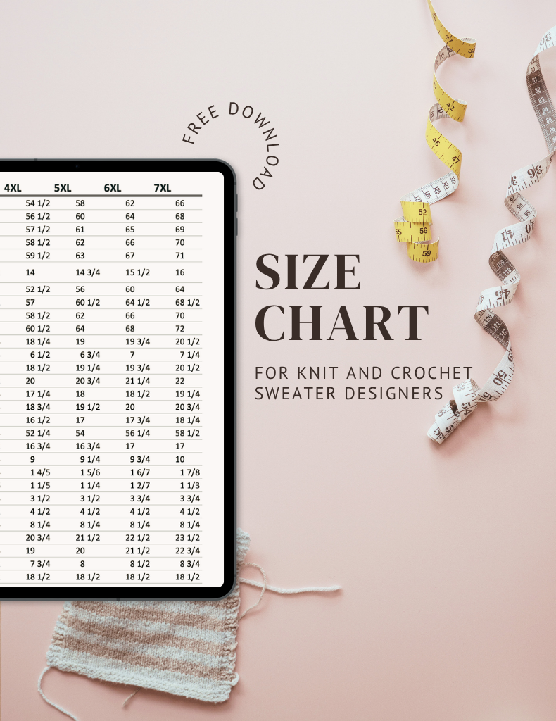

Ysolda’s size chart for knitwear designers
Inclusive size charts for sizes xxs to 7xl, created by a knitwear designer and featuring measurements that can be difficult to find. Newly updated with an extended size range with measurements for cup sizing and broad shoulders.
Read More
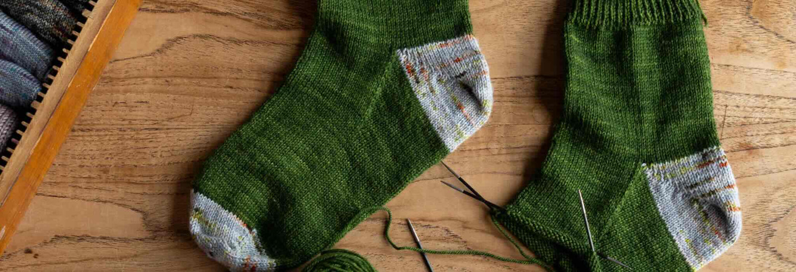

Deep Shadow Heel Tutorial
The Deep Shadow sock heel is a beginner friendly short row sock heel that provides a more anatomical fit like a heel flap and gusset.
Read More


20 Years of Ysolda Knitting Patterns: Part 2
June 2025 marks twenty years of designing knitting patterns for Ysolda. In this blog post she picks her favourite from each year for 2015 to 2025,
Read More