


Kits

New! Celebrate this chapter of Ysolda.com as it comes to an end with a special, personalised bundle of our best products, hand-picked by our team just for you.


gift 2019

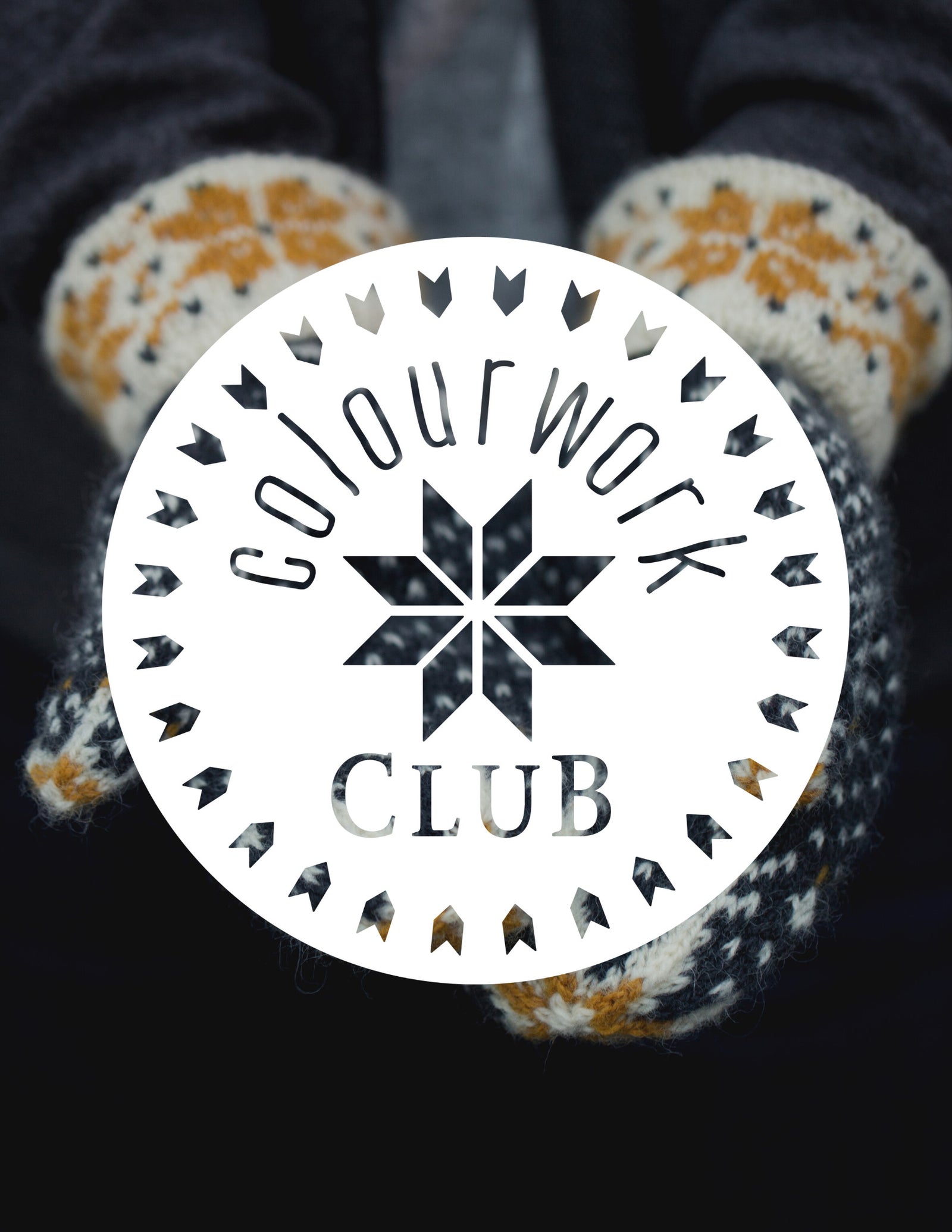


Subscribe to our Colourwork Club for a gift that lasts well into the new year. Your recipient will receive a new colourwork kit in Janurary, February and March
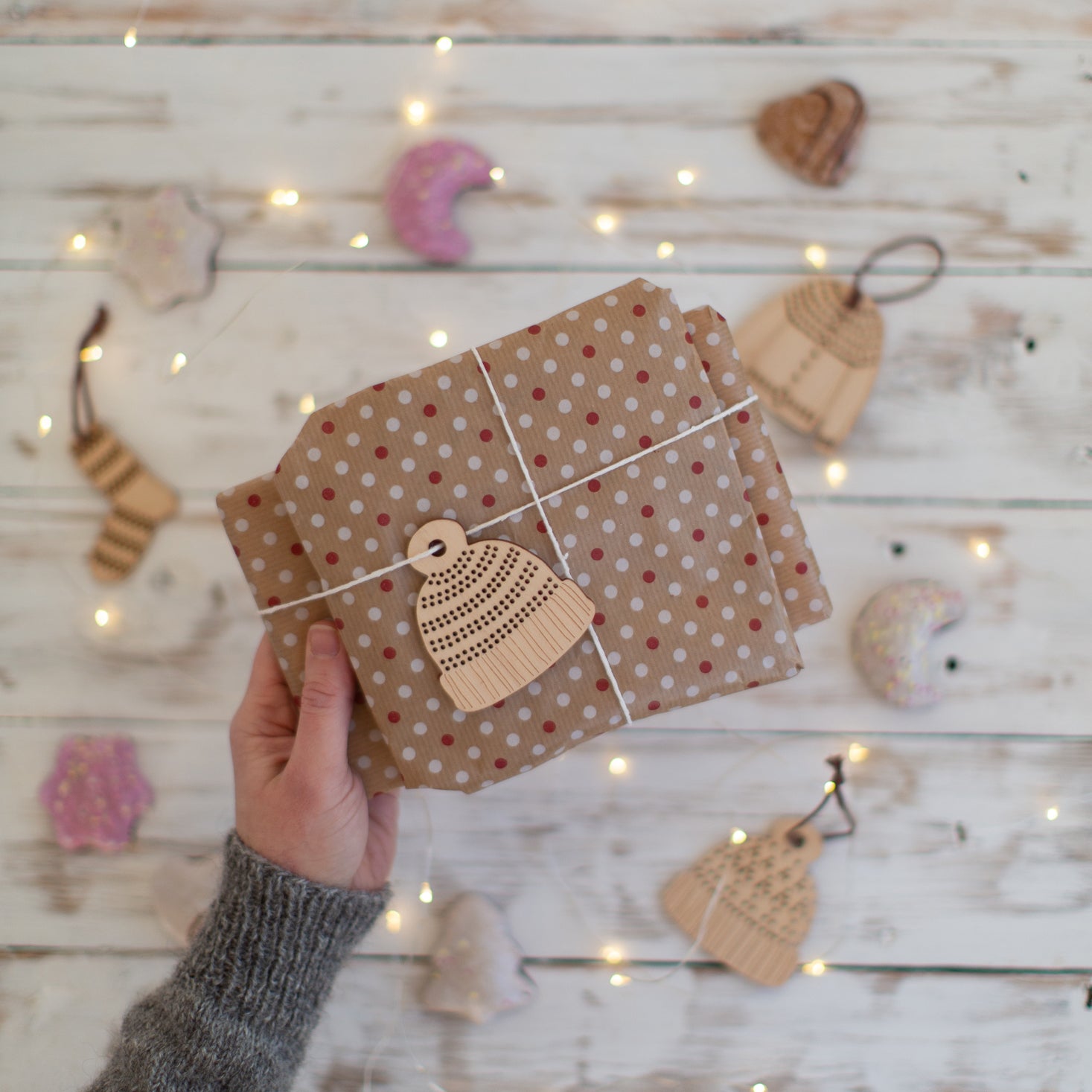
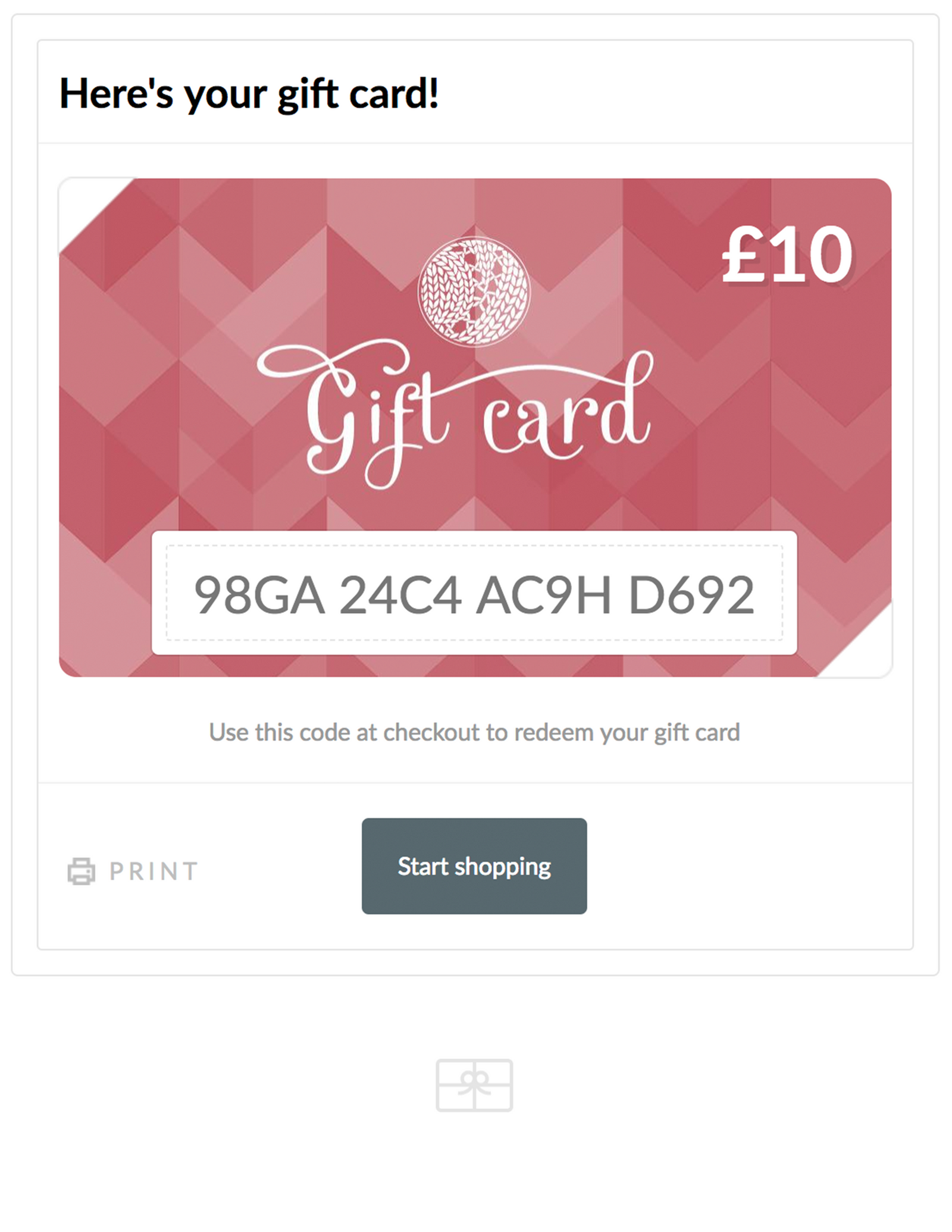
Last minute shopping? Gift cards are delivered electronically - forward the email or print it for your recipient. A range of amounts are available and gift cards don't expire.

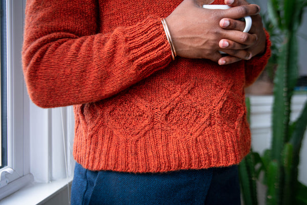
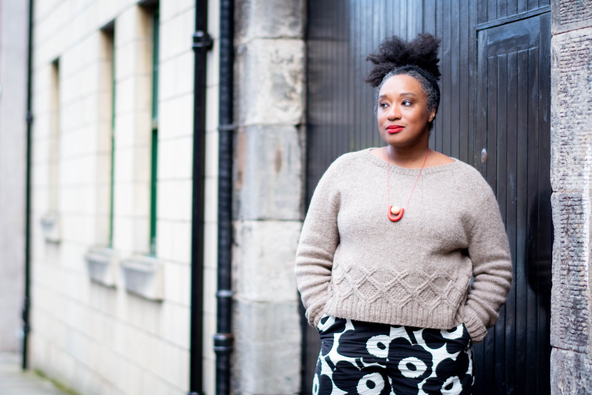
Bruntsfield in Finull and some suggested colour combinations
Bruntsfield in Finull and some suggested colour combinations
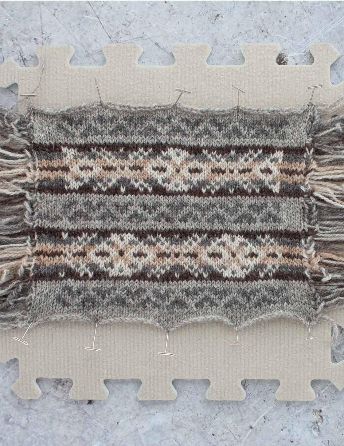


Autumn is vest time and we decided to go into Ysolda’s back catalogue and pull out a great autumnal classic. The Bruntsfield vest was originally worked in five undyed colours to make the most of the amazing variety of Shetland fleece, but it is also a great canvas to play with colour. The larger motifs are traditional Xs and Os worked against a gradient background and the smaller motifs (called peeries in Shetland) use the middle of the gradient as their dominant colour.

We don’t stock the Uradale undyed colours anymore, but after Dianna Walla shared her version in Finull PT2, we realised it was also a great choice for Bruntsfield.

Dianna made hers in shades of grey and black - she used
C1 - 414
C2 - 404
C3 - 436
C4 - 403
C5 - 405
I started swatching these ideas before the heathers came in, but they arrived in time for the last swatch. Heathers are often the perfect 'in between' option when trying to mix colours together in fair isle - the depth in their tones can help bridge colours.

A neutral version
This is not an exact recreation of the original Bruntsfield - Finull PT2 colours are dyed rather than natural fleece, but it is an autumnal combination of greys and browny beiges.

C1 - 405
C2 - 404
C3 - 4081
C4 - 4078
C5 - 406

A purple version
This started as a attempt to blend greens and purples but by the time I had looked at several combinations by holding balls together and looked at the contrast options available it ended somewhere quite different.

C1 - 425
C2 - 487
C3 - 488
C4 - 406
C5 - 4010

A rich reddy brown version, using the heathers
With this version I knew I wanted to take advantage of the beautiful red browns from the new Finull PT2 Heathers but I struggled to find a good contrast for a while. At first I was unsure this acid yellow would work but often a colour combination that wouldn't work in stripes is just what's needed for fair isle.

C1 - 4132
C2 - 406
C3 - 4120
C4 - 4137
C5 - 4121
When coming up with colour combinations for Bruntsfield, it is helpful to group the background colours for the Xs and Os as a gradient from darkest to lightest and then look for 1 contrast colour that works with all 3, which is your motif colour and 1 that contrasts with the middle colour in the gradient which is your background colour for the peerie stripe.
If you want to try out some colour combinations, we've got several tutorials that will be helpful:
Swatching in the round
A method for playing with colour combinations before you swatch
Colour dominance
Also in Journal
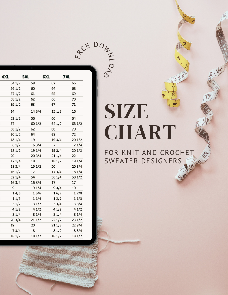

Ysolda’s size chart for knitwear designers
Inclusive size charts for sizes xxs to 7xl, created by a knitwear designer and featuring measurements that can be difficult to find. Newly updated with an extended size range with measurements for cup sizing and broad shoulders.
Read More
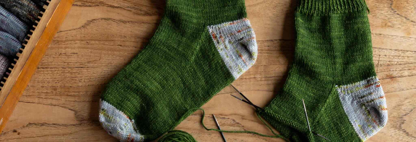

Deep Shadow Heel Tutorial
The Deep Shadow sock heel is a beginner friendly short row sock heel that provides a more anatomical fit like a heel flap and gusset.
Read More


20 Years of Ysolda Knitting Patterns: Part 2
June 2025 marks twenty years of designing knitting patterns for Ysolda. In this blog post she picks her favourite from each year for 2015 to 2025,
Read More